
Pasta Bar


Simply Tasty Catering Amsterdam

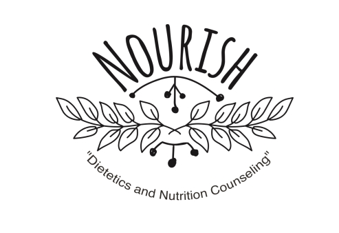
NOURISH
Restaurant and bar “It’s Lit” Curaçao:

Vita Vegetarian Cuisine (2016) :
![]()


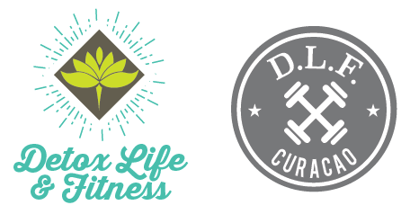
Detox Life Fitness (Not Completed)
Geometric Pineapple(2016):

Curacao Sea Gems:


Piet Zwart Project:

Piet Zwart was a Dutch designer born May 28, 1885 in Zaandijk, North holland. He had trained as an architect and began graphic design at age thirty-six. his training as an architect included designing furniture and interiors. He worked in Jan Wils’ architectural office from 1891 – 1972. His architectural design moved toward a more functional design after he worked with ‘De Stijl in 1919. De Stijl’ in Dutch for “The Style”, also known as neoplasticism, that was a Dutch artistic movement founded in 1917 in Amsterdam. De Stijl consisted of artists and architects. An example for the group’s members were the painters Piet Mondrian (1872–1944), Vilmos Huszár (1884–1960), and Bart van der Leck (1876–1958), and the architects Gerrit Rietveld (1888–1964). The artistic philosophy that formed a basis for the group’s work is known as neoplasticism—the new plastic art (or Nieuwe Beelding in Dutch).
Neoplasticism

Inspired by the neoplasticism and his own use of the primary colors

The work that Zwart did for the NKF Company in Holland can be spotted by his use of primary colors, clean sans-serif typography and photo-montage. Formally trained as an architect Zwart referred to himself as a hybrid between a typographer and an architect.
One of Zwart’s Interior Kitchen Design

Projects Conclusion
After getting a load of information about Piet Zwart’s past and whom he was, dear viewer. It’s time to get to the projects conculsion..
I got an assignment at college where I had to make a little brochure book about his life in Dutch and translated in English. How I was going to combine them together was my own challenge. I had 3 weeks to finish the project. Soo I obviously started brainstorming at that point.
I had to combine informative text and give the brochure book a Piet Zwart’s feel. After brainstorming for hours and getting to know the designer better. I decided I was going to use abstract figures and combine them with pastel matt colors. I made a few sketches of the brochure on paper and started ‘crafting’ with pin’s. At the end of that week I chose to use the pins for the translation boxes. I wrote the brochure it self in English and overlapped the pinned textboxes in Dutch. If you want to see the result of the brochure book, scroll down the page to see it. 🙂


